My most recent project, re-imagining and designing new icons for a proprietary accounting software application.
Client
MuniSoft
Year
2026
Services
Sketching
Vector-Based Digital Output
Multiple Stages of Iteration
Creation of "Tiny Versions" (16px x 16px versions)
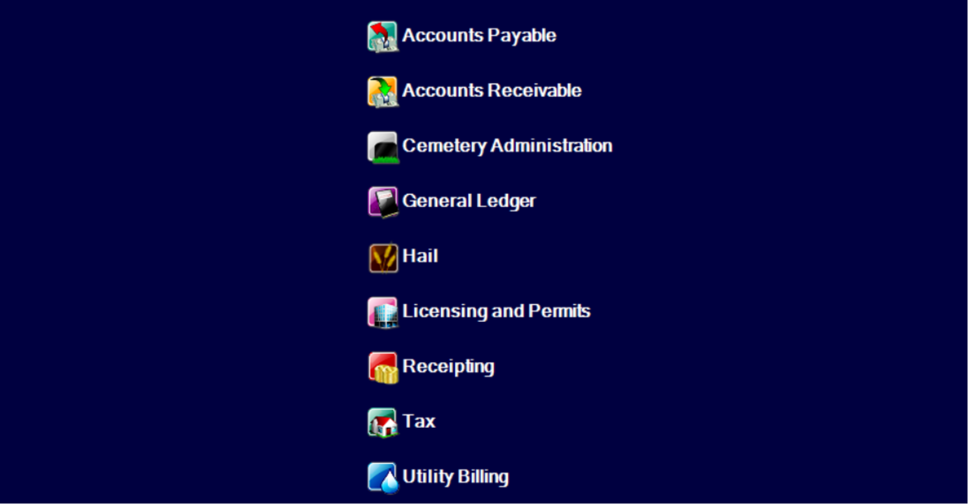
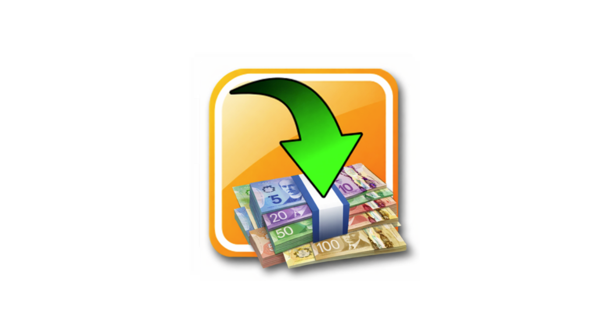
The Old Icons
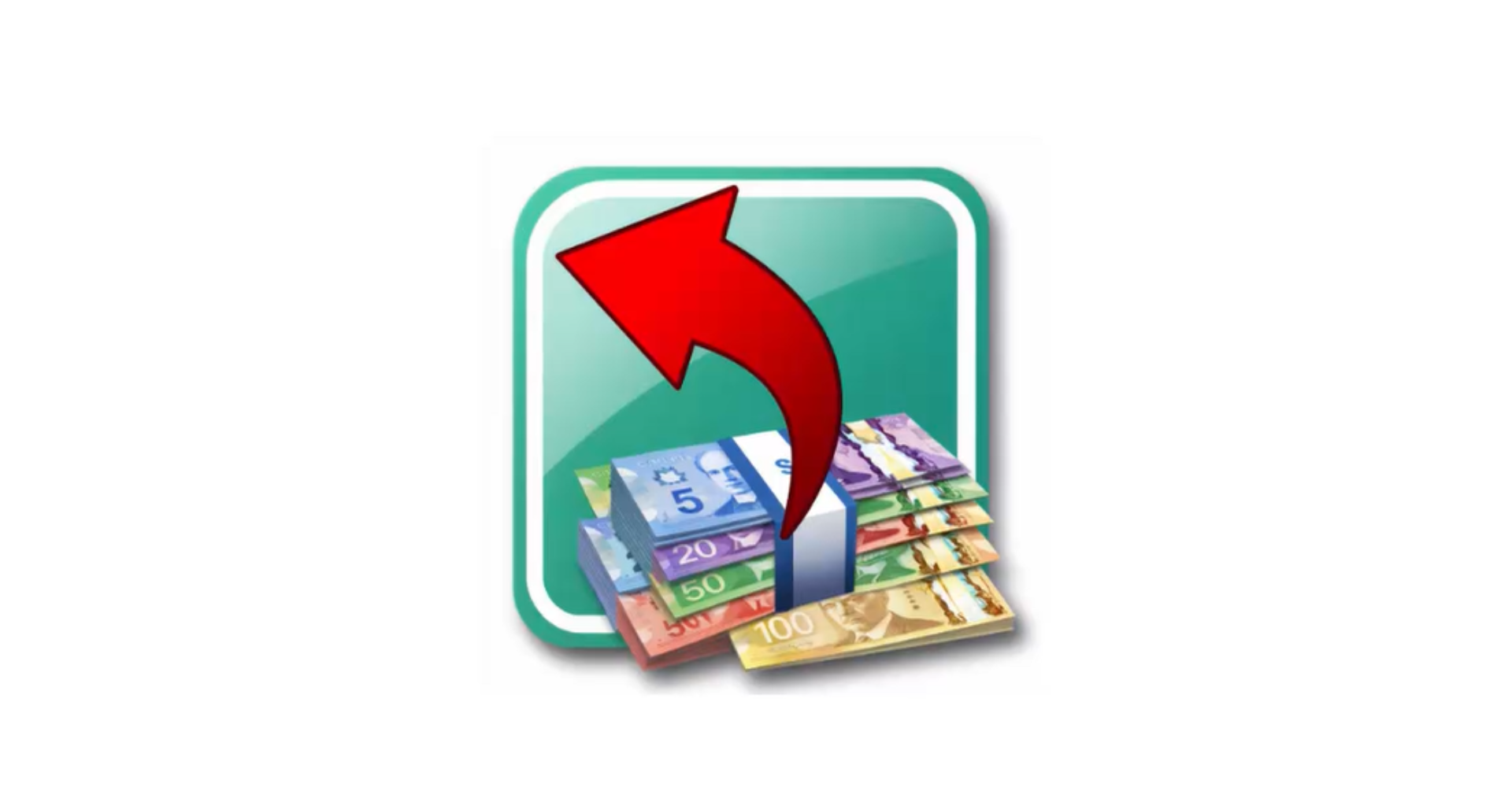
The New Icons - In Process
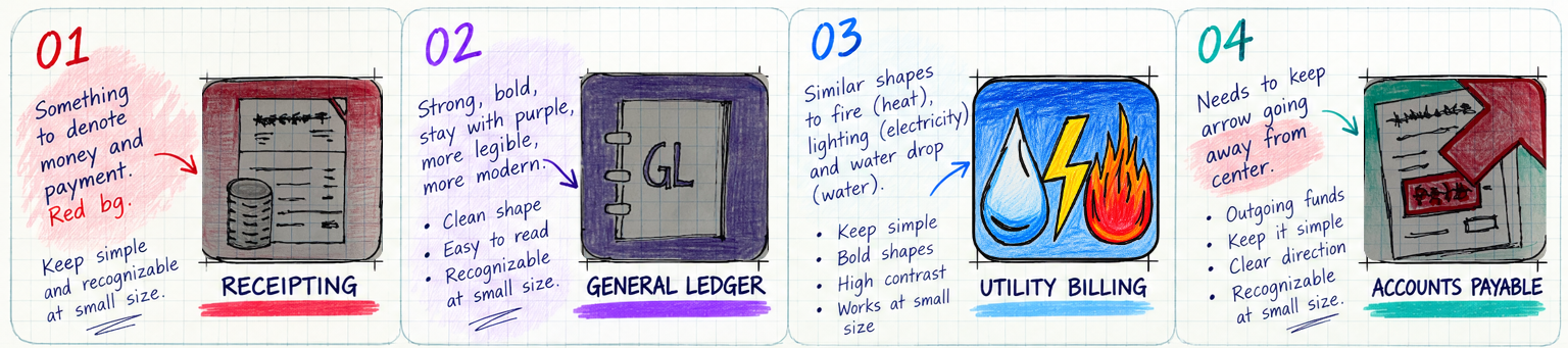
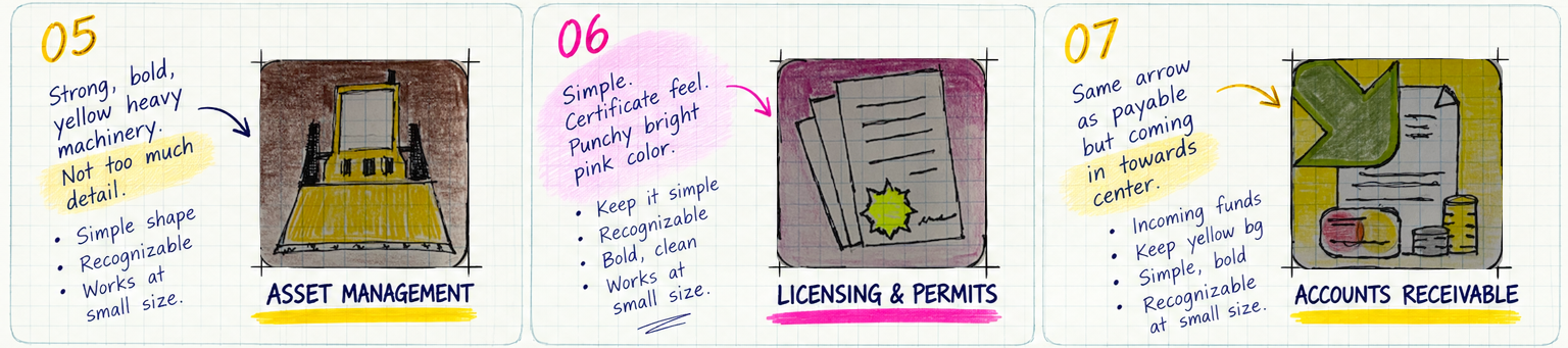
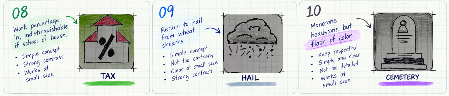
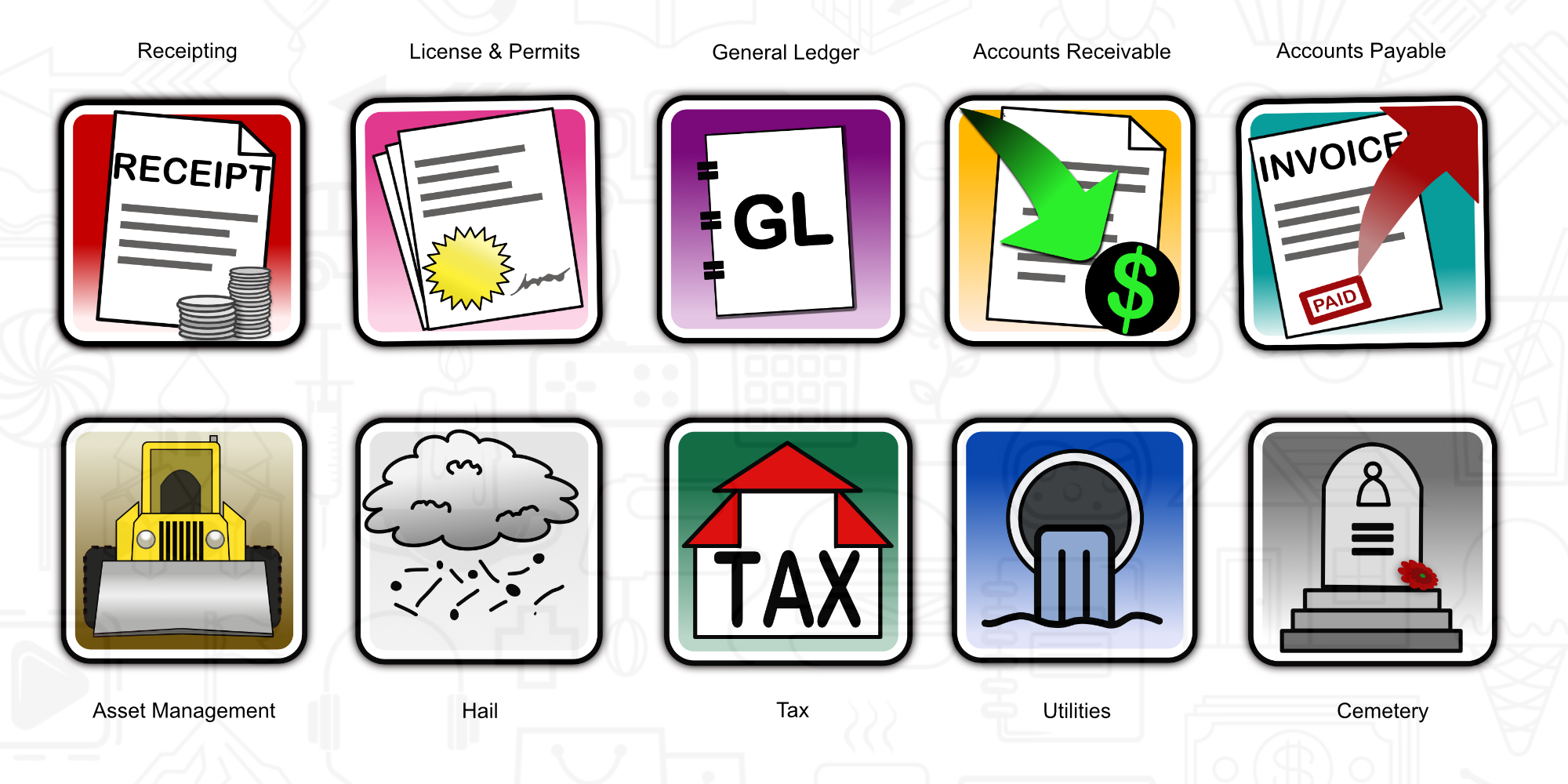
The New Icons - Completed








The new designs blend simpler shapes, bold colors and less detail to communicate more.
The MuniSoft icons had served the company well for many years. However there were some issues with some of them garnering complaints from staff and clients alike. In addition, there was a new application called Asset Management, that was about to launch and needed an icon.
MuniSoft’s icons were designed for a larger view than what clients were generally seeing them at (which was as small as 16px x 16px within their program screens).
The skeuomorphic 3D designs, heavy shadows, intricate detailing, and overlapping textures, meant that the well-meaning designs, were instead appearing as indistinguishable visual clutter.
The Redesign was aimed at accomplishing a number of goals simultaneously: First, it needed to connect the icons together into a stylistically similar group, giving them a united, consistent feel.
Next, it needed to make them more legible at all sizes as well as on both light and dark backgrounds. Finally, the icons needed to include a new Asset Management icon and be ready for other new program icons in the future as needed.
The Redesign improves and modernizes the overall look and feel of the MuniSoft icons. It focuses on less detail for each icon and in so doing they become more powerful and effective. It helps to give the icons a cohesive look and feel. They are simpler, crisper and more legible at all sizes. This allows users to more easily find and recognize them in the software program saving time and making for a more enjoyable user experience.
⸺ Connected to the Past
When possible a shade similar to the current background color was re-used to assist clients with recognition and a sense of continuity with the old.
⸺ Less is More
Drastically simplifying the icons focusing on 2-3 elements maximum helped each icon communicate more effectively and efficiently.
⸺ Built For Everywhere
Bold strong framing lines, smooth gradients and color ensure maximum visibility on both dark and light backgrounds.
⸺ Strike a Balance
Rounded corners with straight bold interior lines made the icons approachable yet classic, avoiding short-term icon trends.
⸺ Unique yet Alike
Purposefully ensured each icon was unique and easily distinguishable from the others but retained similarities for thematic unity.
⸺ Maximize Legibility
1024px-icon design for use in larger formats and 16px simplified designs for smaller use inside the software application.