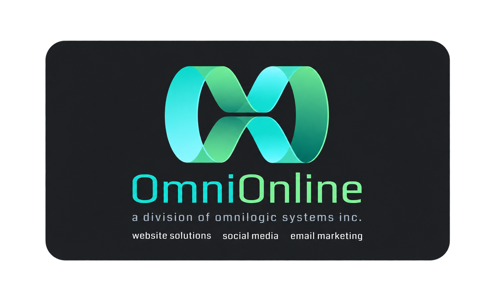
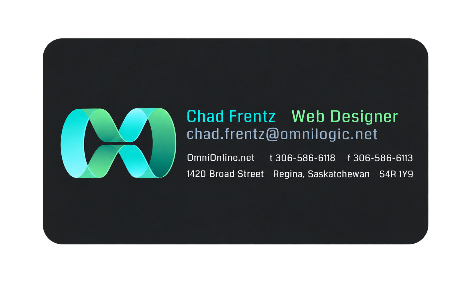
My first design was while we were still a division of a parent company called Omnilogic Systems. I focused on branding with a large, bright “Omni” symbol on a clean dark background.
I liked the card-front because it was clean and orderly and the whitespace really made the logo/brand pop. The back of the card re-iterated the large strong “Omni” brand and added the important contact details. The font was quite robotic and futuristic feeling.
The material was a thin card stock with a matte finish that was fairly slippery. The cards had a fine-quality finish and slid off your fingers easily. I used a local printer but found that the pricing was quite high.
Overall the company was pleased with the clean, technical feeling of the design that felt applicable for an online solutions company.
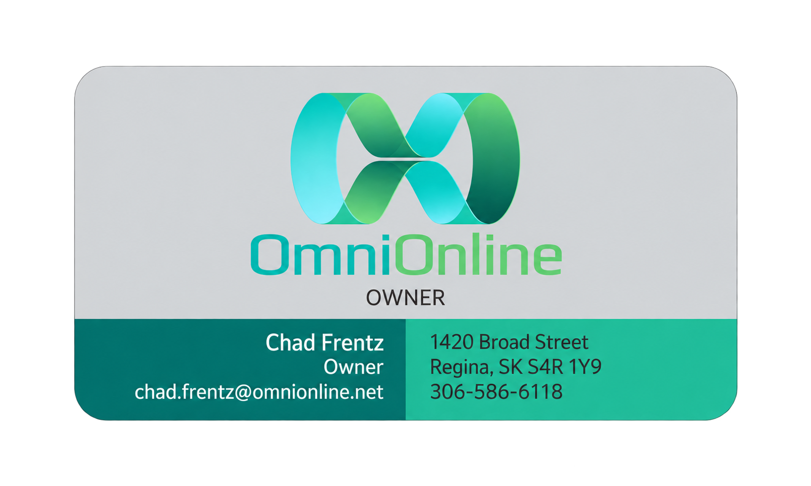
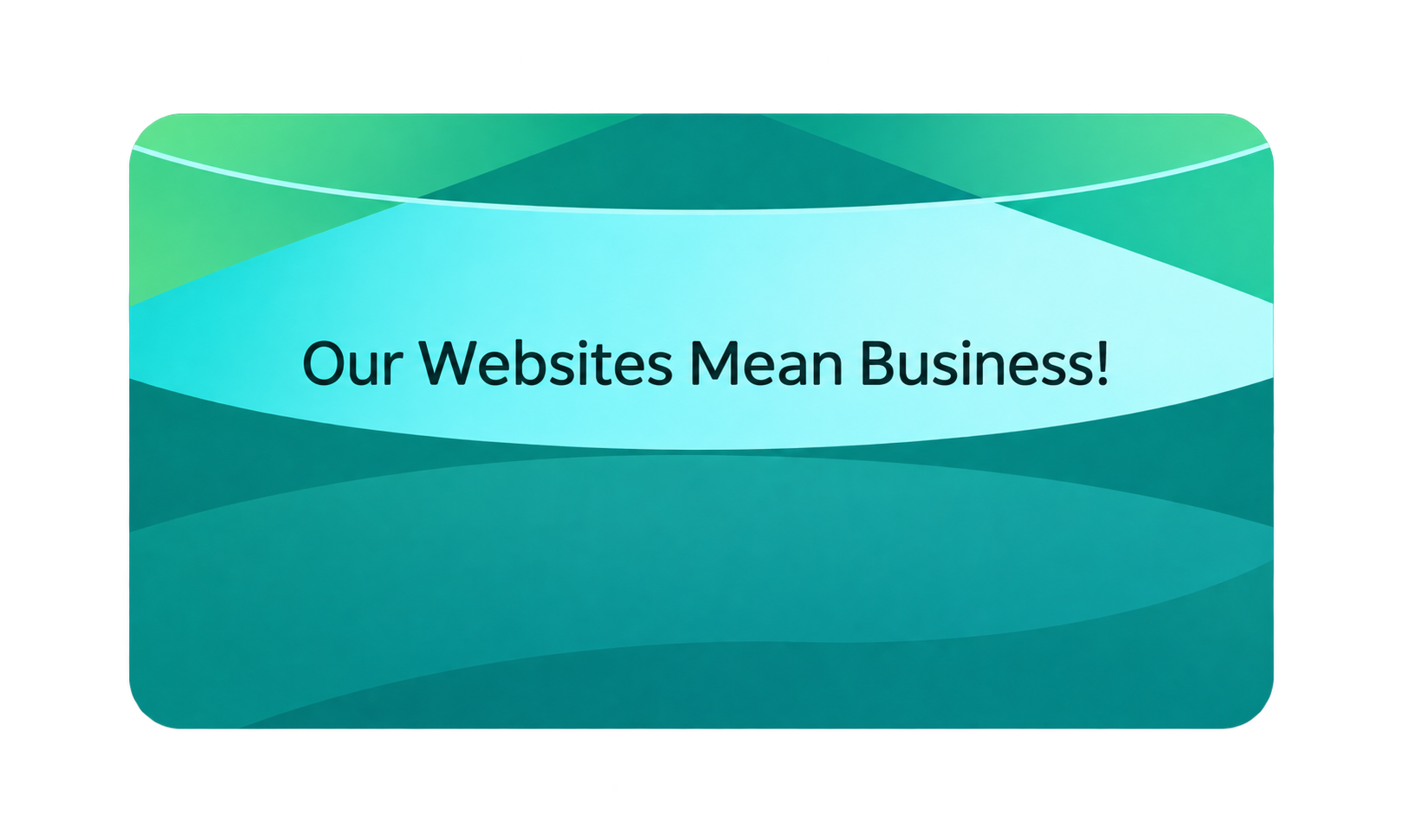
The second variation I worked on was after OmniOnline had split off from Omnilogic Systems and was no longer a division of the parent company. I felt the change warranted a fairly strong redesign and really wanted to work in our new slogan: “Our Websites Mean Business”.
I decreased the size of the logo on the card-front and used up the space efficiently with contact information. The design rationale was that the old card’s front text was too small and needed to be increased in size.
I moved away from the futuristic font to something more everyday. I also moved away from the dark colors, sticking with our palette of greys, greens and blacks but also playing with balance and tension. Darker fonts on lighter backgrounds, lighter fonts on darker backgrounds and opposite but equally-sized divisions to house the text content.
I wanted to try and efficiently fit all the contact info onto the front of the card so that turning it over in your hand really wasn’t necessary. I placed the slogan on the back on top of a variation on a portion of our logo, but turned sideways.
Going with a glossy front and a matte back as well as a thicker card stock and ordering the cards from a large US-based supplier meant our costs decreased substantially and the time from order to product-in-hand was just a few days.
Overall I liked the card, especially the budget but we agreed that it didn’t look or feel quite as rich and high-quality as the first version.
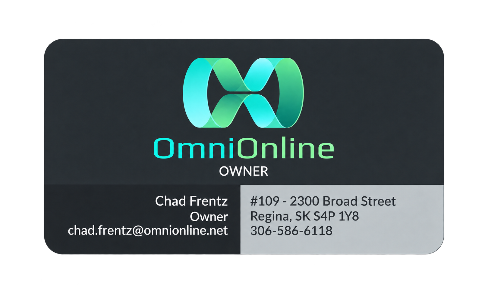
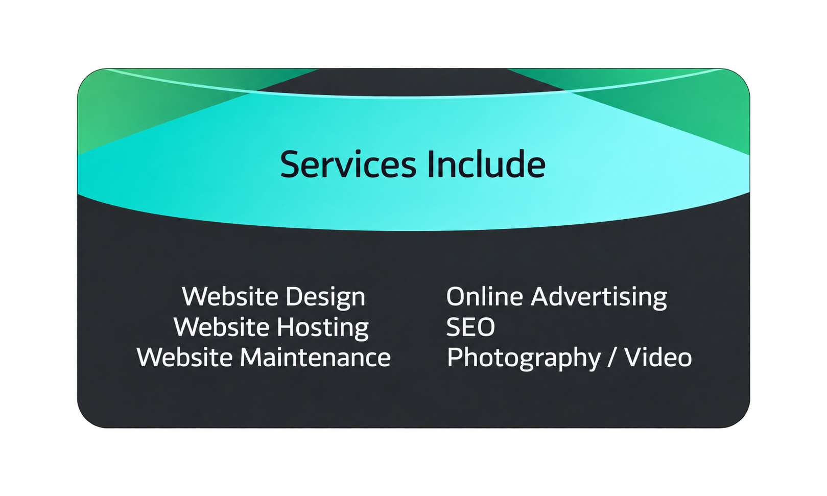
The final version I worked on was needed after we moved out of our 1420 Broad street location and purchased our own space a few blocks south. I also attempted to correct some of the things I felt we got wrong on the second version.
First, I moved away from the lighter grey to a slate grey. The bottom right panel of version 2 had dark font on a medium green that was quite hard to read without looking at it up close. So I moved to a lighter grey background color, making the text more legible. I also didn’t like the shiny finish on the second version, as it felt cheap and made the card hard to read in some lighting conditions so I moved back to a matte finish that solved this issue.
I decided the back of the card wasn’t being used very efficiently so I removed our slogan and added services that we offered. I felt this made the card work on two levels: It not only communicated our contact info but also acted like a mini advertisement, clarifying for potential customers what services we could help them with. I also increased the size of the font on the card-back to make it as legible as possible.
My business partner and I both really liked the direction this third version took and the resulting feel look and feel. The cost remained low and we stuck with this version for a number of years as we didn’t see anything that it was not doing well for us.